Cover of the forthcoming book, Tower Grove, from Reedy Press, of Saint Louis, Missouri. By Mark Abbot, with Kerri Bonasch and a foreword by Ron “Johnny Rabbitt” Elz.
From the Reedy catalog:
Tower Grove is a brief history of a collection of neighborhoods that abut Tower Grove Park. Built out shortly after the turn of the century, the Tower Grove community has been the bedrock of South St. Louis over the last one hundred years...The book is a part of the Reedy Community Series, and is due out in October 2009. Previous titles in the series include St. Louis Hills

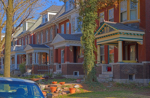
Here is a photo I took on April 11th, 2009. A crop of this image is seen on the book cover above, and this image continues across the spine and onto the back of the book.
This was taken on the south side of the 3500 block of Halliday Avenue, in the Tower Grove East neighborhood of Saint Louis.
I was dubious about this particular scene, because it was so poorly lit by the afternoon sun, with both glaring highlights and deep shade, but these buildings were important to capture due to their distinctive architecture. No single digital camera exposure could capture this subject in a way that preserves both the highlight colors and still provide adequate shadow detail.
Many people, myself included, have been disappointed by digital photography, because images are so often overexposed, or are overwhelmed with digital noise that appears as colored splotches in shadows. Highlights are often pure white or with odd color shifts, like blue skies that come out bright cyan. These problems often wreak havoc on human skin tones, where perhaps it is the most noticeable. Proper exposure is critical in digital photography, much more so than with film. This limitation proves critical for me when I photograph the interior of churches: the problem being how to simultaneously present detail in stained glass windows while providing detail in the church furnishings. The solution is to take an overlapping series of photos of the same subject, and then blend them together on the computer.
This image is a blend of six separate exposures, which presents nearly the entire luminous range of the original scene, while preserving the colors of the highlights and having detailed, low-noise shadows. I attempted to do this exposure blending by various ad hoc and widely-known techniques, but the results were all unsatisfactory, and so I had to come up with my own method to get good results. No previous technique — that I am aware of — is able to do this in a manner that appears realistic. This is an improvement over the techniques used in Catholic St. Louis: A Pictorial History, which in turn was state-of-the-art in 2008 when I worked on those photos. My technique is improved again lately, and I hope everyone enjoys the results.

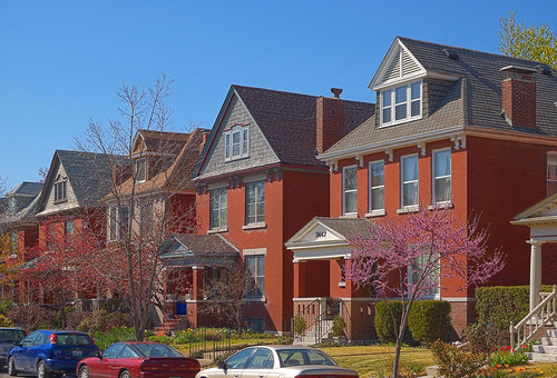
Here is another photo I took in this series.
In my photography, I typically let the symmetry and order of the subject itself dictate how I ought to compose a photo. The buildings in this neighborhood present a good opportunity for photography, since they are similar in design, yet with variety, making them an inherently interesting subject. The colors in this photo are mainly dictated by nature, from the blue sky, the natural red color of the clay brick, and the colors of the vegetation; so it is important that the clarity of these natural colors be preserved in the final images.


No comments:
Post a Comment